GROGETTERS
For my Interaction Design Studio I class, our group was tasked to create a native app to support grocery shopping during a pandemic.

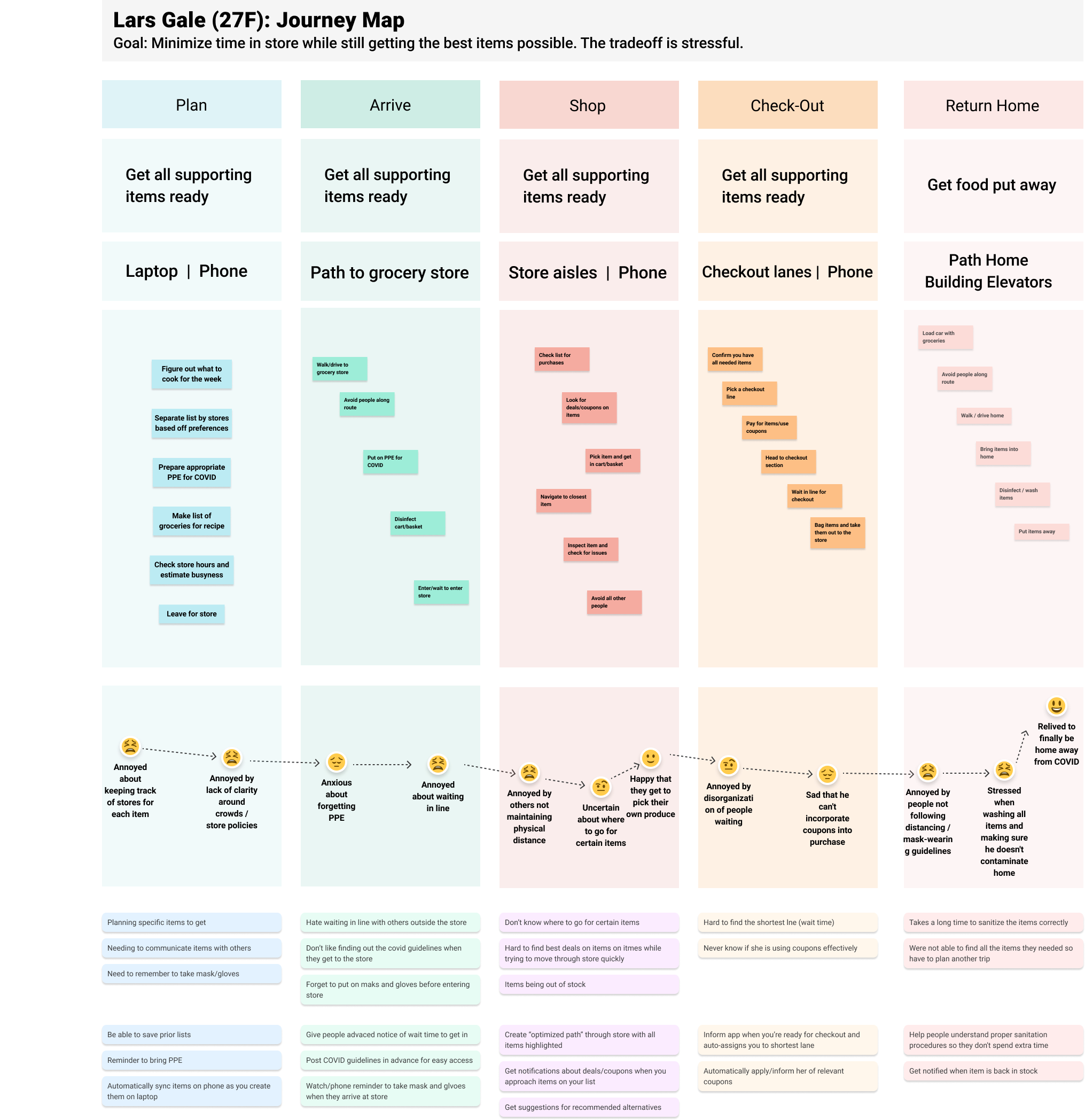
To begin with, our group conducted pop-up research to engage with potential target users and get to know their needs, behaviors and pain points in relation to their grocery shopping experience.

Our team decided to hone in on the shopping phase since the map revealed the most meaningful opportunities for improvement in this phase.

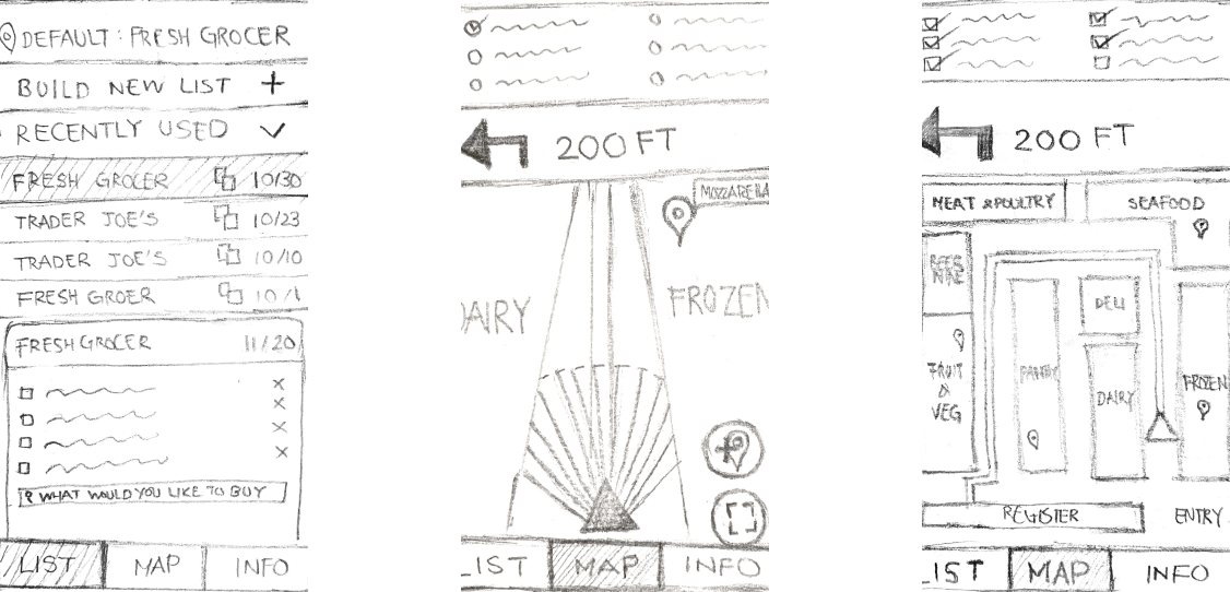
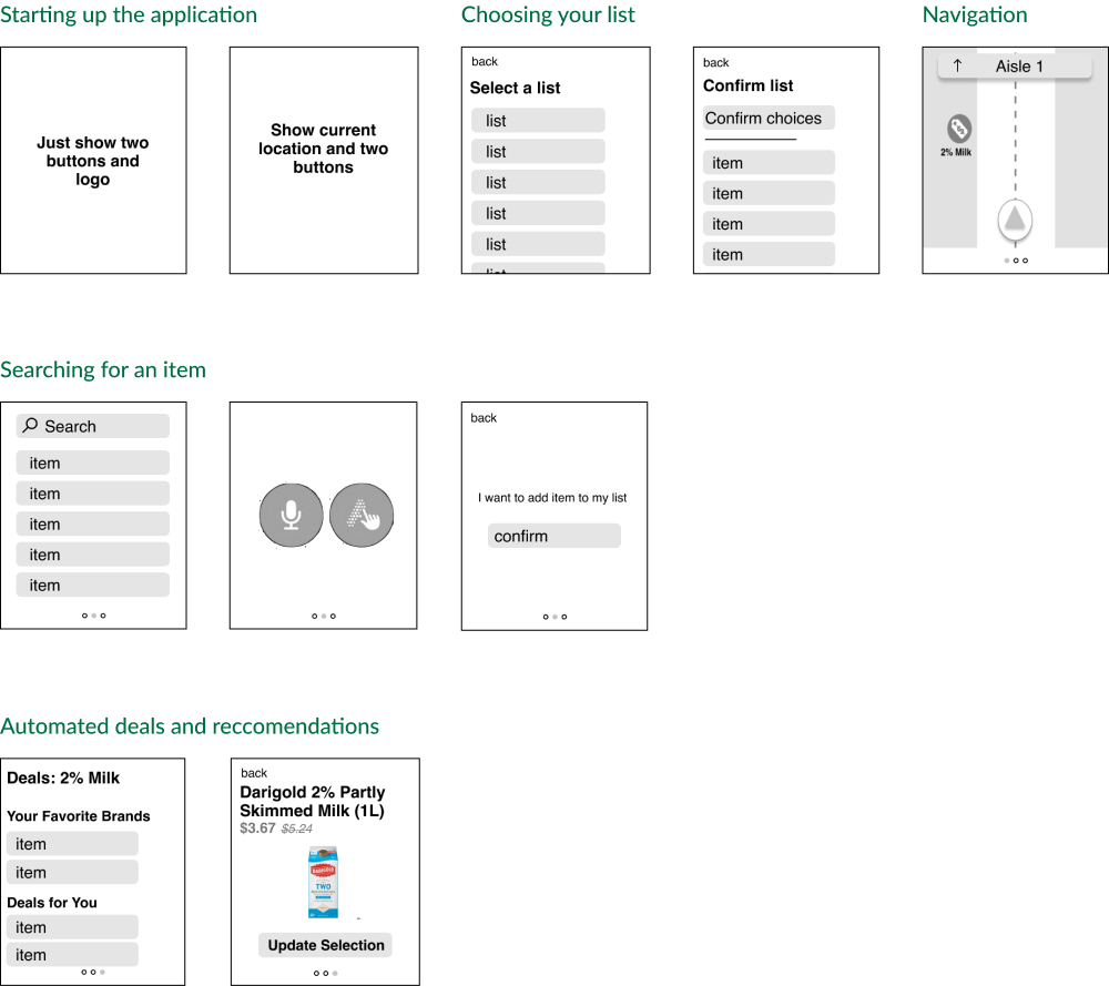
We were able to narrow down the diversely proposed solutions down to some key points, including: creation and editing of grocery lists, selection of stores for navigation, a separate and easily-switched map view and list view, focused navigation of one item combined with the display of peripheral items in view, a guidance specificity matching the specificity of the items written in the list, minimizing interaction with the app during navigation, automatic item update based on user’s location, display a summary of items in current isle, presentation of deals upon click on an item, addition of items to the list through a list tab available in the navigation view, display of availability of items for in-store addition, and a flexible scale of the navigation view when approaching an item.

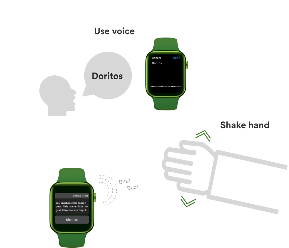
When diving into the watch design we wanted make sure that when translating from mobile we were being conscious of how to display the same information in a clear and concise way on the watch. Additionally we thought a lot about how to best use the affordances of the watch and maintain our goal of making the watch version better support customers who wanted to limit contact with their devices while shopping around the store.

When designing the motion and interaction for the application we focused on useing subtle animations to make the overall experience cohesive, interaction techniques that would limit the physical interaction with the device, and appropriately used feedback mechanisms to capture the user’s attention.