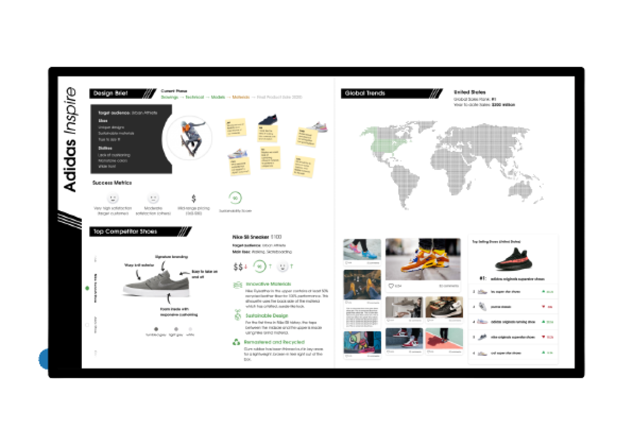
ADIDAS DASHBOARD
For Interaction Design Studio II, my team designed a dashboard that displays key information about Adidas that would generate innovation and inspiration and includes a physical control.

The dashboard needed to address the needs of three different personas: Executive (Ansela), Product Manager (Kenny), and Designer (Sos).
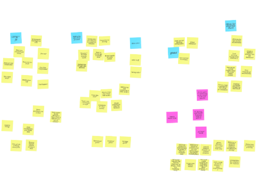
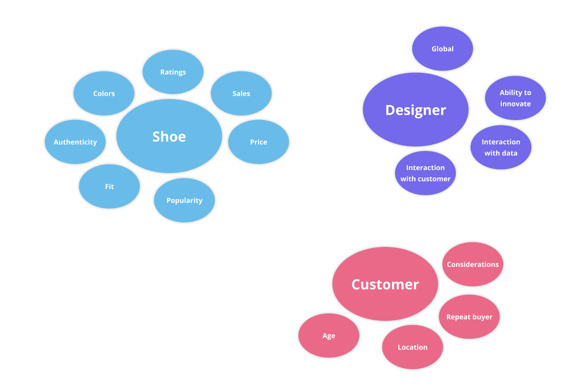
In order to gain a better understanding of our key personas’ needs and to synthesize the relevant data on Amazon, our team created an affinity diagram to summarize and generate insights. We summarized the main goals of our personas and from there, we created an affinity diagram of a future model of a dashboard broken down to: Products, Designers, and Customers. This future model affinity diagram allowed us to define the success metrics for our dashboard.
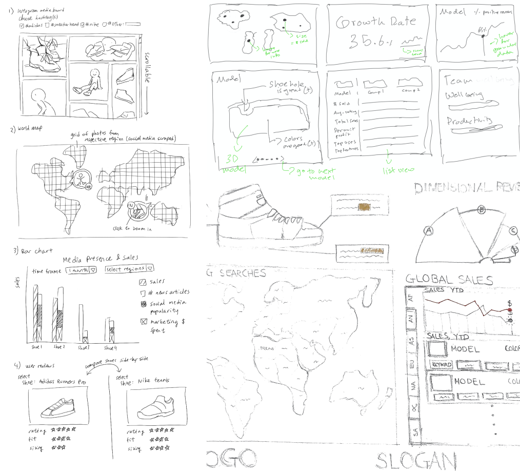
Our next step was to sketch out ideas for our dashboard. The initial sketch included a world map view as a key element for a measurement of success. Another element identified in our sketches early on were different types of comparison between Adidas and its competing brand.
After consolidating the common elements between our sketches, we transitioned from our hand drawn sketches into a digital format using Figma. We concluded that showing a direct comparison with top competitors would be critical information for our target audience and decided to use metrics including style, cost, fit, and width since they seemed to be the most important. Another element we took from our sketches was an excerpt of a user interview to provide more qualitative data and build a direct connection with customers. The mid-fi version was a consolidation our “favorite” elements from our individual sketches and forming this helped us narrow down our main goals and intentions with our dashboard.
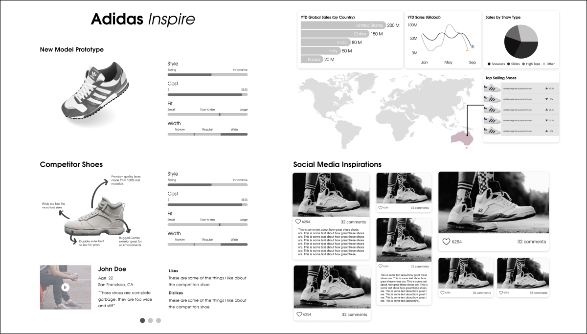
Next, using the insights from our critique, we decided to make key iterations from our lo-fi. We removed the global sales visualizations since we felt that they were not directly actionable for our target audience, and experimented with removing the map from our dashboard and increasing the emphasis on comparing current in-progress products with competitor products since it representated the most actionable visualizations on our dashbaord. Through multiple rounds of iterating and refining, we were able to sucessfully incorporate these phases into our dashboard design. We finalized the section to provide phase-specific data (including customer research data and relevant competitor shoe data) to the designers so that the inspirational and informational elements are always relavent to the problems they currently face. Our next step was to design a physical control to be incorporated into our dashboard. We decided on which part of the dashboard we would be able to control. We knew that we wanted to give the designers the ability to scroll through the competitior shoes to give them enough time to analyze each one individually. Taking the main goal of our dashboard of inspiring designers into account, we built the brand of our dashboard to be “Adidas Inspire.”
